


Information Architecture
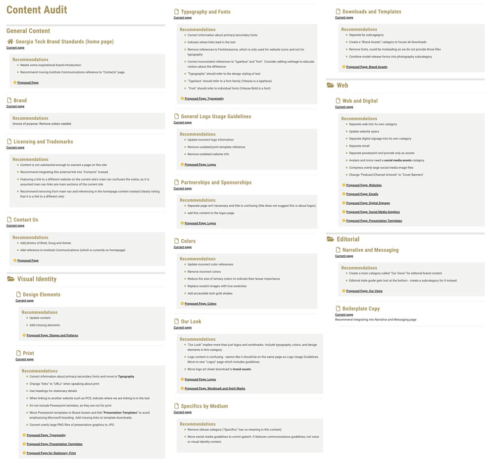
Content Audit
When conducing a site update and redesign, it is often best to start with a content audit. A design system should support the content needs of the site. A content audit allows us to identify the content we must support and find patterns and relationships that will help us organize the content and the system.
A content audit is also an excellent opportunity to identify UX problems we may need to overcome. If a page exists as a gateway to another piece of content but serves no purpose currently, we can recommend removing that page to give the visitor a simpler path to the content they are looking for.
I often use visual sitemaps when doing a content audit in order to get an overview of what sort of content types and signifiers are needed. Rather than just replacing them, I will work to make their significance more clear to the visitor by using consistent styles to indicate the nature of a piece of content.
Information Architecture Recommendations
Next, I created a document detailing my recommendations for how we might reorganize and update the existing content. Creating detailed documentation in multiple formats helps to invite collaboration and ensure consensus among stakeholders.
A detailed document of recommendations for how to reorganize and update all existing content.
Revised Information Architecture and Sitemap
I provided a text-based site map illustrating my recommendations. I used text rather than visuals at this stage so we could focus on organizing the content. I use folder and document symbols to indicate when we are referring to a section of documents (like the Brand Assets section) and when we are referring to a single document (like our "Contact Us" page.)

Simplified list-based information architecture recommendation.
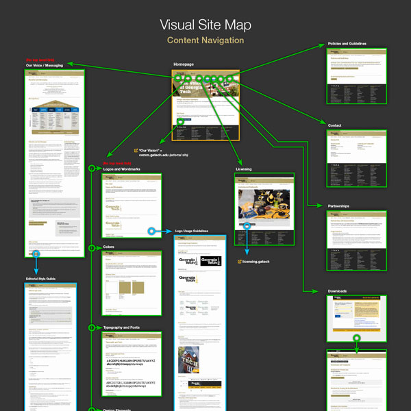
I moved on to create a visual sitemap using wireframe symbols for our pages. These symbols help us to identify the nature of each content type.
Tier 2/main section intro pages lead with a visual header and feature internal sidebar navigation for that section. Content pages do not have visual headers. Where a tier 3/content page is also a section intro page leading to tier 4 content pages, it is styled like a tier 2 main section intro but without a visual header.
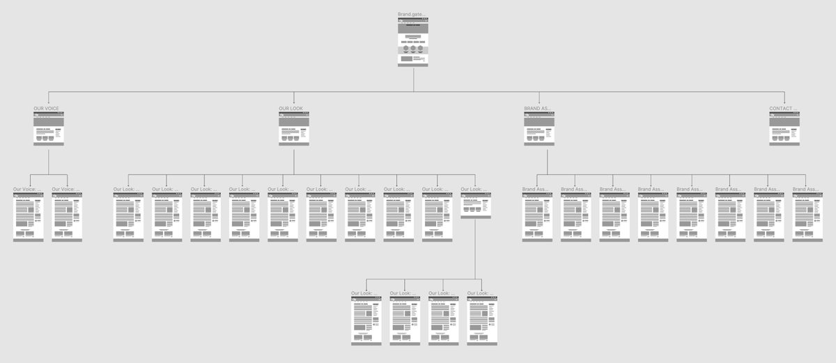
Figma Wireframe sitemap showing the page layout type for each tier of content.
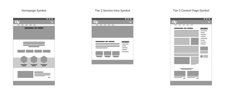
Wireframe page symbols help us to visually categorize types of content.
Design System
I created new designs in Figma to support the types of content we needed to support on the site. Brand asset downloads, for example, needed to feature a recognizable flag so that visitors who needed assets would be able to scan the content to find them.
When working with teams who are not familiar with design systems, it can be helpful to introduce them in this way so as to facilitate the connection between the content we have been auditing and the value of creating a visual system which supports the content and is meaningful to the visitor.
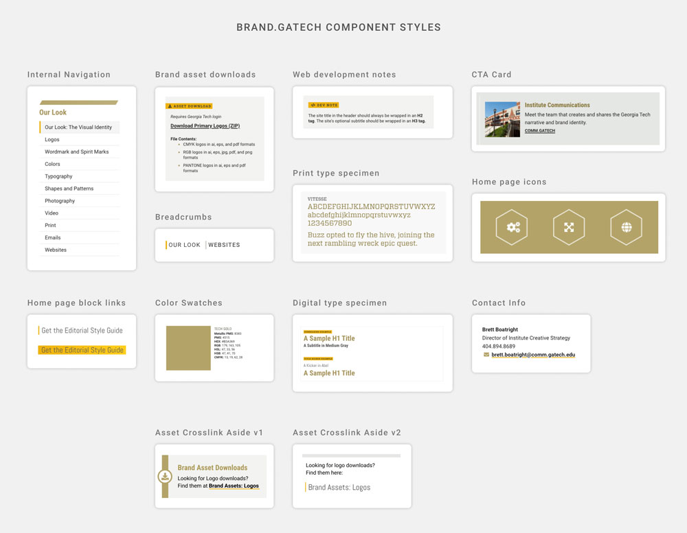
A sampling of redesigned components.
Revised Visual Sitemap
I rounded out our process by providing a new visual sitemap much like the one I created for the initial content audit.
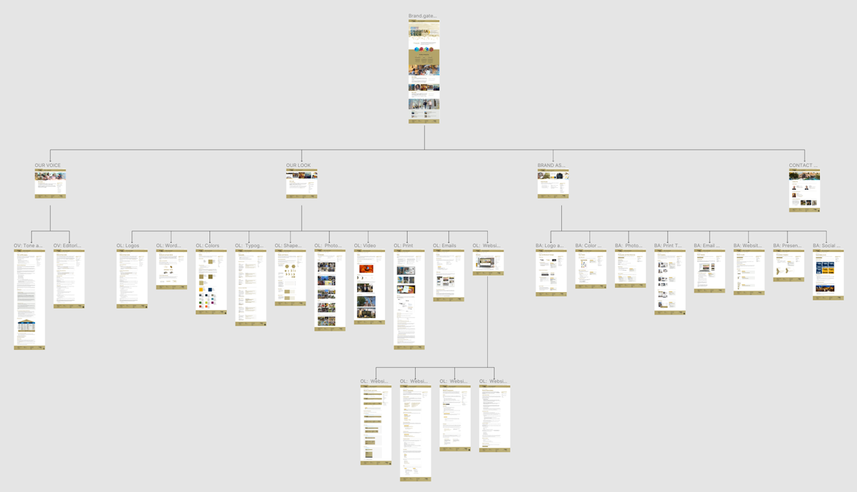
Figma Wireframe sitemap with screenshots of finished pages.
Homepage SVG Animation

Scroll-activated SVG animation created using After Effects, Bodymovin, and Javascript.
Main Sections Redesign
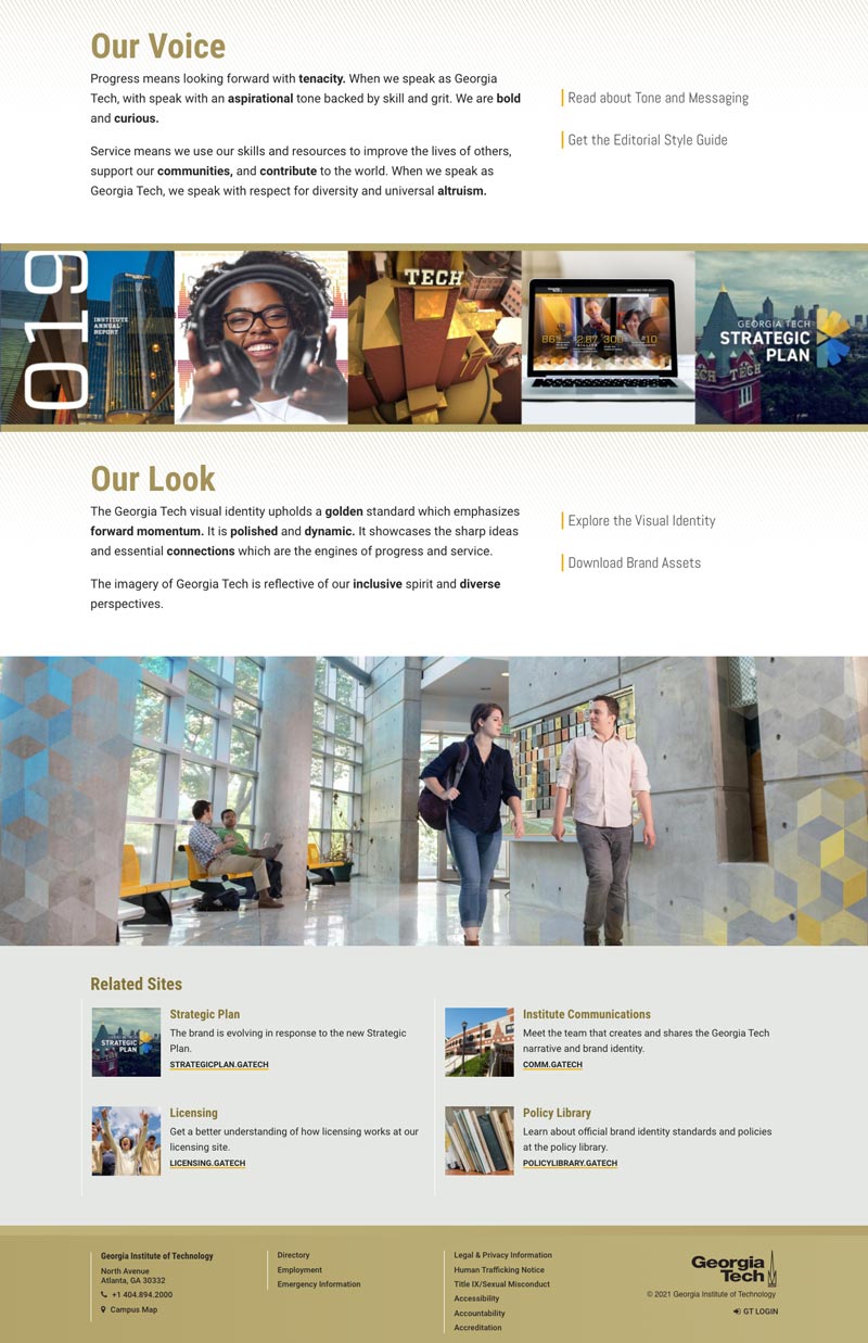
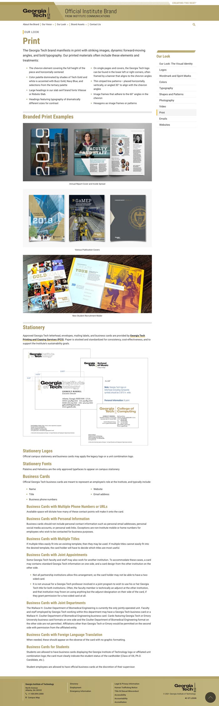
Our Look
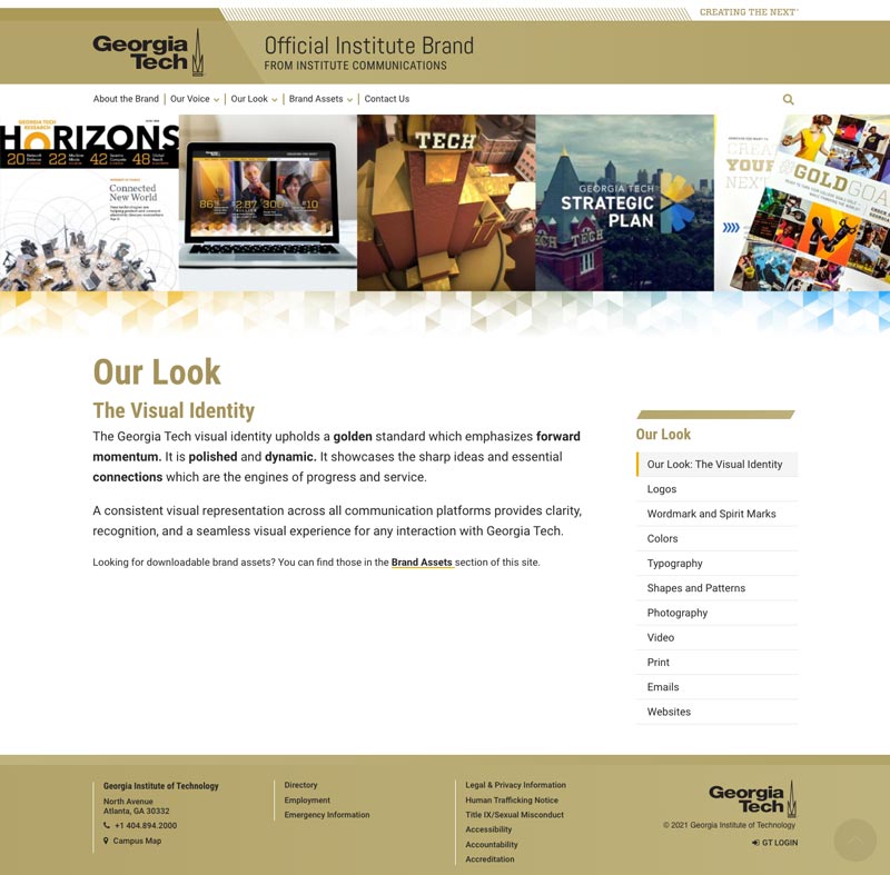
Main site section intro pages feature a visual header graphic to signify the type of page (main content introduction page). All sidebar navigation is sticky on desktop so it remains accessible while reading long-scrolling content.
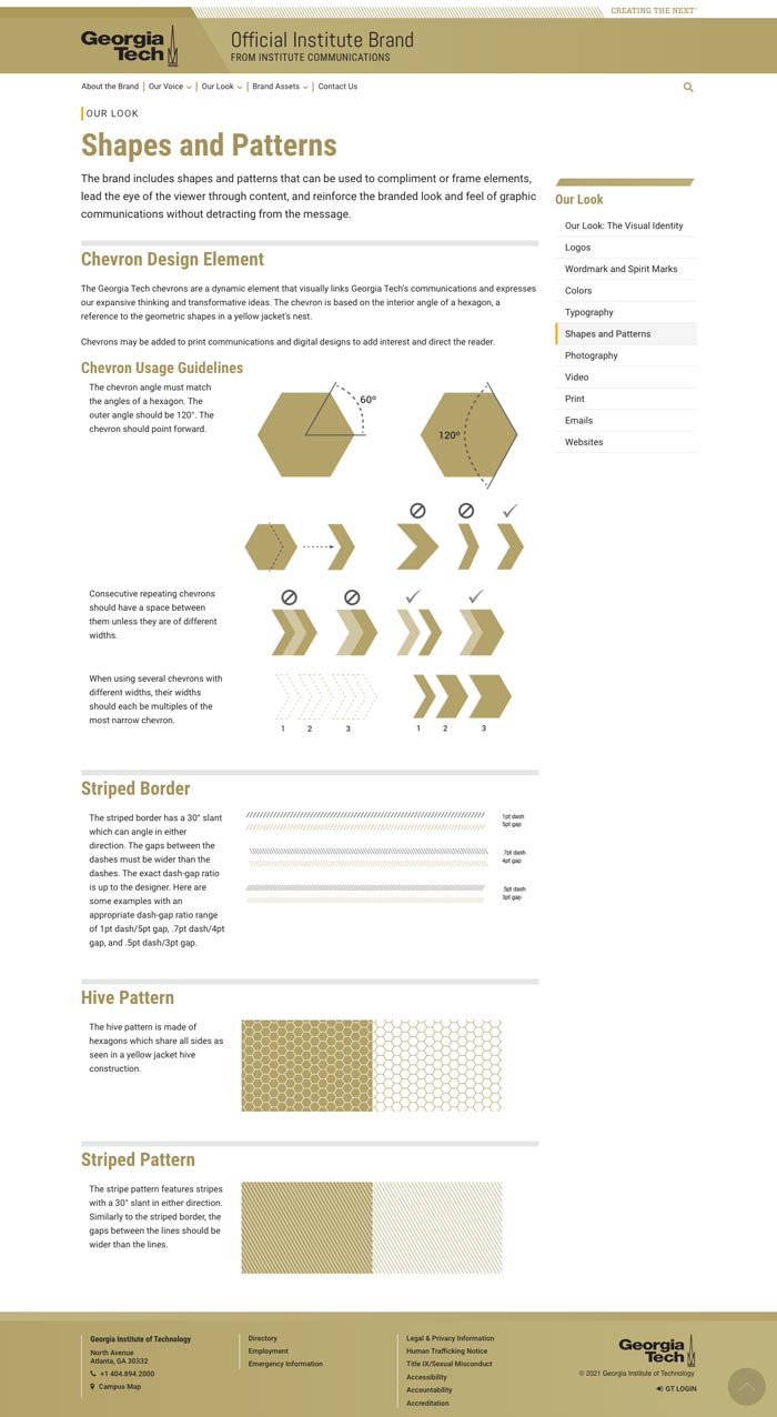
Third tier content pages have a simplified heading. They cut right to the chase, immediately presenting the specific content the visitor came to find.
Brand Assets

The brand assets main introductory page, which features a sidebar navigation giving the visitor easy access to the section contents as well as a synopsis of the content of the present section. This helps the visitor to decide if the section they are in contains the content they are seeking. The main site navigation for this section matches this menu structure exactly. This consistency helps the visitor feel reassured that they understand the structure of the site content and can find what they are looking for.
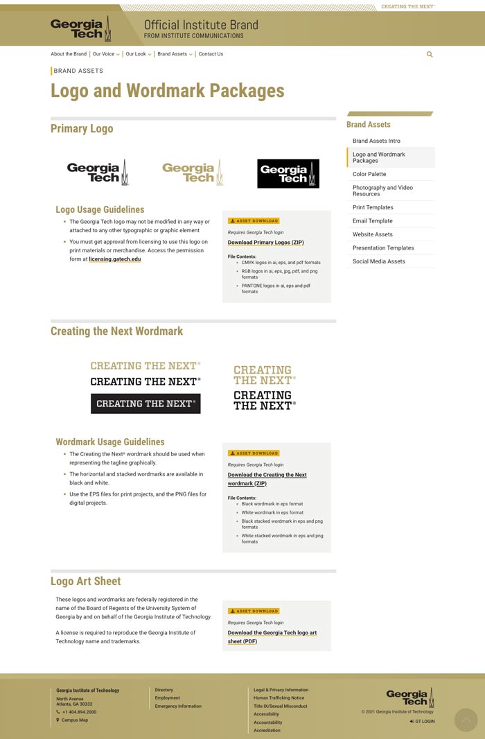
Pages featuring downloadable assets highlight this type of content in a light gray block with icons indicating a download is available. Details about the contents of each download are listed. A visitor should be given as much information about downloads as possible so they understand the content they are putting on their machine.
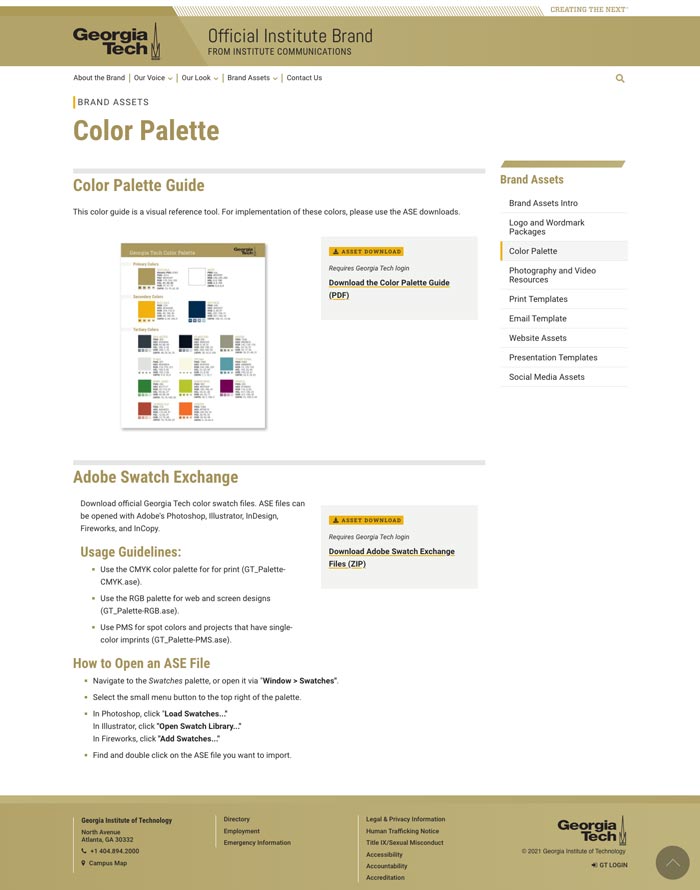
In addition to the internal navigation on the sidebar, an enlarged breadcrumb style over the page title helps the site visitor to recall which main section they are exploring.
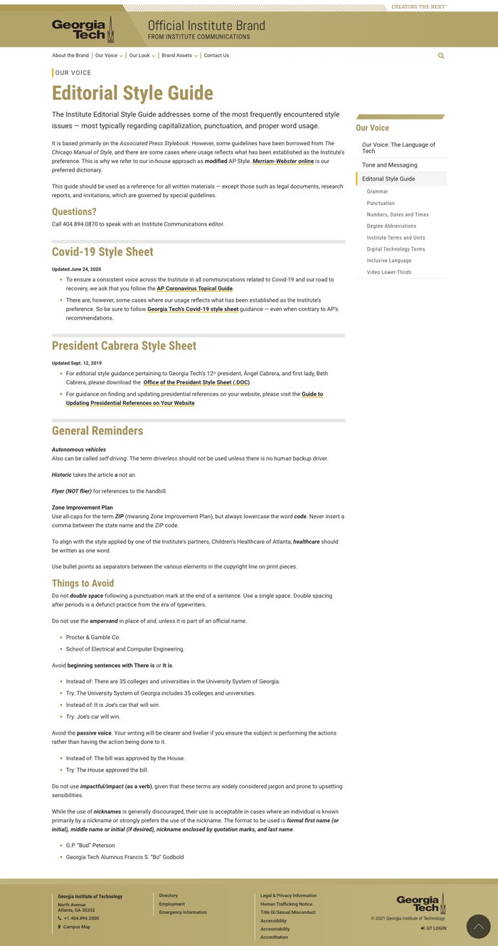
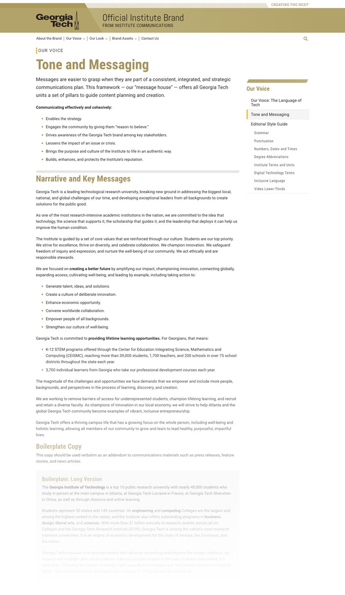
Our Voice

The main intro page is primarily an introduction or synopsis of the content of that section which helps the visitor decide if this section contains the content they are seeking. The content itself is divided into pages within that section.
Drupal Content Layout Tool
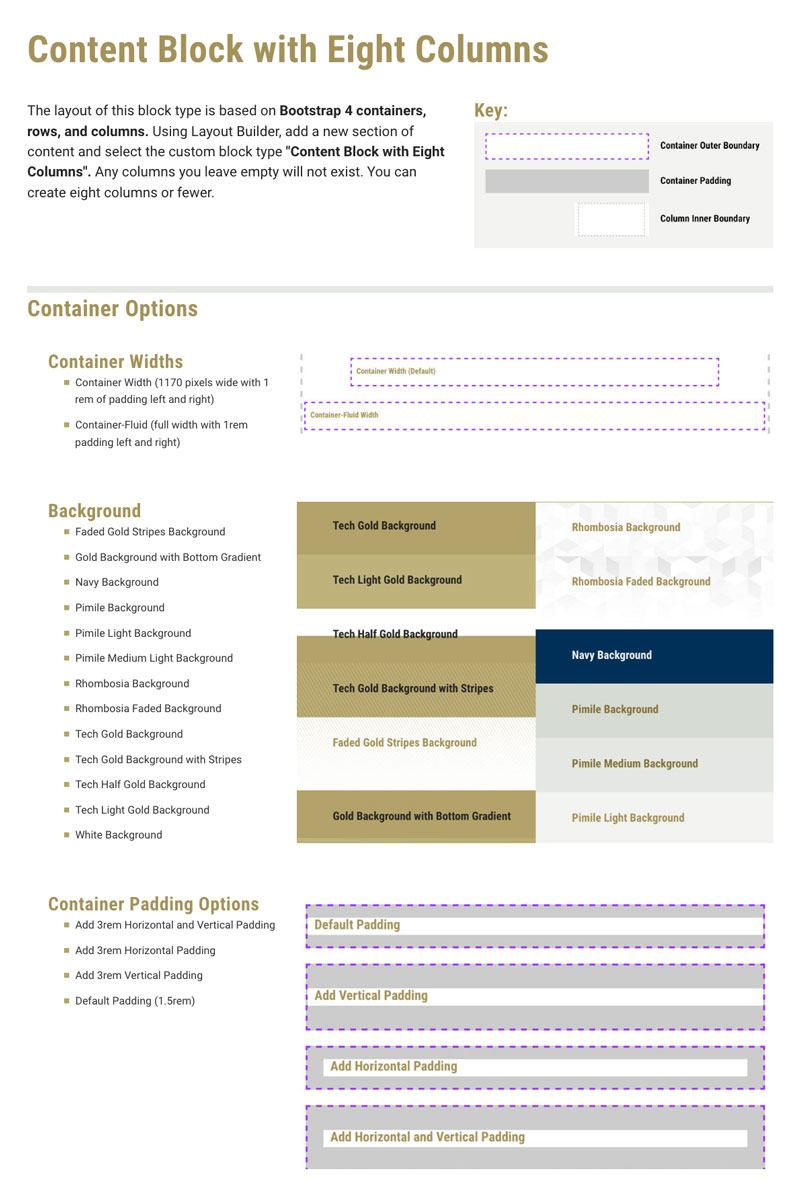
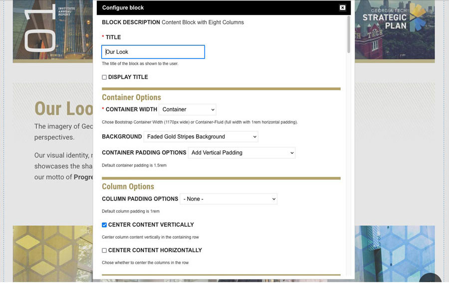
This site redesign presented an opportunity to work on a custom layout tool for content creators, which had been a long-term goal of mine. I wanted to allow future site editors to build new rows of content with background options for each row. I also wanted to give them options for controlling the column layouts within those rows.
Rows and Columns
Although the Layout Builder module offers support for custom layouts, the column structures it provides did not align well with our Drupal theme, which was based on the Bootstrap grid. I used the Layout Builder module in this case for its ability to add limitless rows of content to a page. But rather than using Layout Builder's column structures, I created a custom block content type with the column layout options I wanted to provide for each row.
Creative Options
A creator will use it like this:
- Add a row of content using Layout Builder
- Choose the width of the row (1200px max container or full width)
- Choose padding for the row (horizontal, vertical, none, or both)
- Select a background color or pattern from the design system
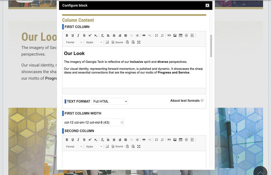
- Add the custom column layout block to the row (up to 8 columns per block)
- Select a column layout from a list of options (responsiveness is built in)
- Choose padding options for the columns (standard, none, or extra padding)
- Choose column vertical alignments (top or center)
Some extra things needed to be addressed here. Giving background options for each row meant writing CSS and a little bit of Javascript (seen below) to ensure any text placed over a given background would automatically adjust in color to provide accessible contrast ratio for legibility. And since some editors might in the future be asked to use this tool with little to no training, I developed this document to guide them.
This tool was successful, but I was interested in creating a more flexible version which utilized the Paragraphs module instead of using Layout Builder and custom blocks. So I teamed up with my web development team for the next iteration of this tool.
Learn about the newest version of the custom layout tool here.
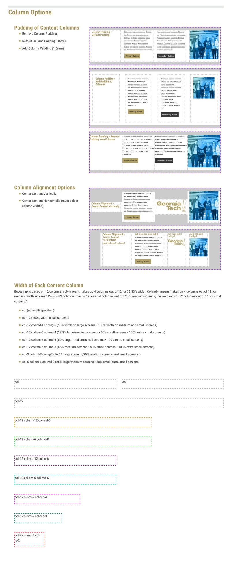
Instructional document detailing options for a flexible custom Drupal 8 layout tool developed for content creators.
I noticed that the editor's view of this layout tool can be confusing for a content creator, and began researching ways to improve content creator UX.
    <div{{ attributes }}>
      <div class="content-block content-block-with-eight-columns {{ background }} {{ padding_options }}">

      {# Attach the library #}
      {{ attach_library('brand/content-eight-columns') }}

      {# Preprocess #}
      {% set body = (content.body) %}

      {% set content_container_width = content.field_container_width.0['#title']|lower|replace(' ', '-') %}
      {% set background = content.field_background.0['#title']|lower|replace(' ', '-') %}
      {% set padding_options = content.field_padding_options.0['#title']|lower|replace(' ', '-') %}

      {% set column_padding_options = content.field_column_padding_options.0['#title']|lower|replace(' ', '-') %}
      {% set column_align_options = content.field_center_content_vertically.0 %}
      {% set column_justify_options = content.field_center_content_horizontall.0 %}

      {% set first_column = (content.field_first_column.0) %}
      {% set first_col_width = content.field_first_column_width.0['#title']|lower %}

      {% set second_column = (content.field_second_column.0) %}
      {% set second_col_width = content.field_second_column_width.0['#title']|lower %}

      {% set third_column = (content.field_third_column.0) %}
      {% set third_col_width = content.field_third_column_width.0['#title']|lower %}

      {% set fourth_column = (content.field_fourth_column.0) %}
      {% set fourth_col_width = content.field_fourth_column_width.0['#title']|lower %}

      {% set fifth_column = (content.field_fifth_column.0) %}
      {% set fifth_col_width = content.field_fifth_column_width.0['#title']|lower %}

      {% set sixth_column = (content.field_sixth_column.0) %}
      {% set sixth_col_width = content.field_sixth_column_width.0['#title']|lower %}

      {% set seventh_column = (content.field_seventh_column.0) %}
      {% set seventh_col_width = content.field_seventh_column_width.0['#title']|lower %}

      {% set eigth_column = (content.field_eigth_column.0) %}
      {% set eigth_col_width = content.field_eigth_column_width.0['#title']|lower %}


      {# Content #}
      <div{{ attributes }}>
         <div class="content-block content-block-with-eight-columns {{ background }} {{ padding_options }}">
             {# Title #}
             {{ title_prefix }}
          {% if label %}
          <h3 class="hidden">{{ label }}</h3>
          {% endif %}
             {{ title_suffix }}
           {# Description #}

          <div class="content-block-inner-wrapper {{ content_container_width }} ">
            <div class="row {{ column_padding_options }} {{ column_align_options }} {{ column_justify_options }}">

              {% if first_column is not empty %}
              <div class="{{ first_col_width }}">
                <div class="col-inner-content h-100">
                   {{ first_column }}
                </div>
              </div>
              {% endif %}

              {% if second_column is not empty %}
              <div class="{{ second_col_width }}">
              <div class="col-inner-content h-100">
               {{ second_column }}
              </div>
              </div>
              {% endif %}

              {% if third_column is not empty %}
              <div class="{{ third_col_width }}">
              <div class="col-inner-content h-100">
               {{ third_column }}
              </div>
              </div>
              {% endif %}

              {% if fourth_column is not empty %}
              <div class="{{ fourth_col_width }}">
              <div class="col-inner-content h-100">
               {{ fourth_column }}
              </div>
              </div>
              {% endif %}

              {% if fifth_column is not empty %}
              <div class="{{ fifth_col_width }}">
              <div class="col-inner-content h-100">
               {{ fifth_column }}
              </div>
              </div>
              {% endif %}

              {% if sixth_column is not empty %}
              <div class="{{ sixth_col_width }}">
              <div class="col-inner-content h-100">
               {{ sixth_column }}
              </div>
              </div>
              {% endif %}

              {% if seventh_column is not empty %}
              <div class="{{ seventh_col_width }}">
              <div class="col-inner-content h-100">
               {{ seventh_column }}
              </div>
              </div>
              {% endif %}

              {% if eigth_column is not empty %}
              <div class="{{ eighth_col_width }}">
              <div class="col-inner-content h-100">
               {{ eigth_column }}
              </div>
              </div>
              {% endif %}

            </div> <!-- end row -->
          </div> <!-- end content block inner -->
        </div> <!-- end content block -->
      </div> <!--end attributes-->
    </div>
Code snippets for a flexible custom Drupal 8 layout tool. This tool is a block type which leverages Layout Builder to add rows of content to a node.


