Lunar Fusion

Georgia Tech Brand Refresh

A Rebranding Case Study

My internal team of two designers was called on to conduct a brand refresh for the university where we served as designers.

We explored new logo options, color palettes, typefaces, photography, shapes, and patterns. We coordinated with a multidisciplinary team sourced from across campus to ensure that the brand we were developing would represent diverse perspectives. Our goal was to create two distinct concepts for our committee to choose from.

Project Details

Tools

  • Sketchbook
  • Adobe Illustrator
  • Adobe InDesign
  • Figma

Roles

  • Assessment of existing brand look and feel
  • Design of new options for typefaces, colors, imagery, and symbolism
  • Design of mood boards and demo content
  • Coordination of multi-disciplinary collaboration teams
  • Implementation of the final updated brand

My Creative Process

It Starts with Drawing

After discussing some ideas about direction with my team, it was time to start ideating. My first step was to get away from the computer.

I put my sketchbook on the floor of my office along with a collection of watercolor paints, colored pencils, books, glue, and paper samples.

I did freeform writing, building prose to convey the feel I intended to channel.

I looked at books on art and design as well as our previous publications.

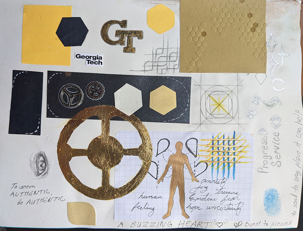
I began to draw, doodle, and collage from the heart. What did we want to convey about who we were, after surviving the pandemic? What were the students and researchers putting their energy into? What did we want prospective students to know about what drives us?

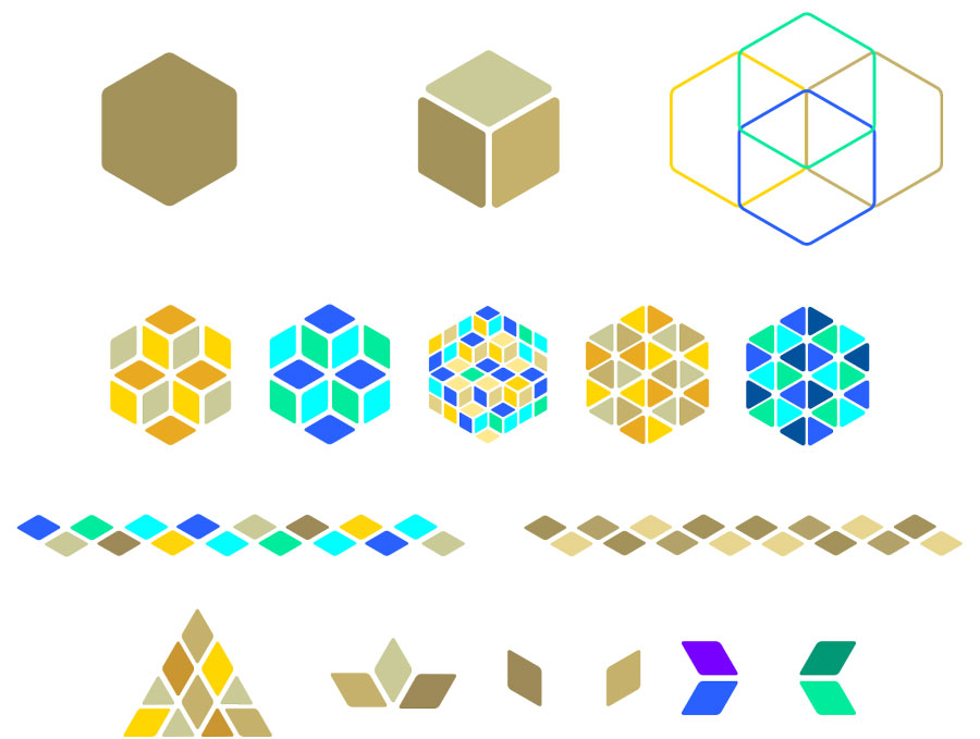
Images began to emerge. Multifaceted mosaic shapes. Diverse perspectives coming together to form new ideas. Bright blue and yellow to convey optimism. Variations on our existing hexagon pattern, modeled after the hive of our mascot, the yellow jacket. Metallic gold, our officially university color, to convey our highest aspirations.
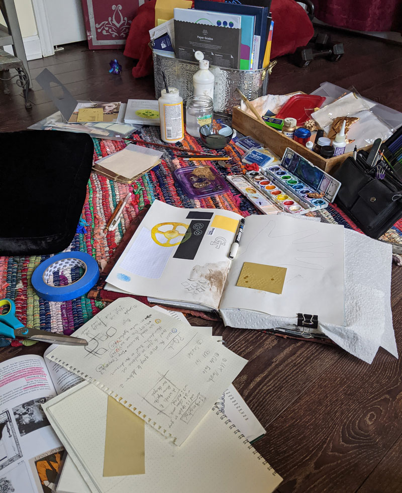
an assortment of art supplies strewn on the floor
sketchbook collage with hexagons, hive patterns, metalic gold gear shapes, a gold human with wings, abstract doodles
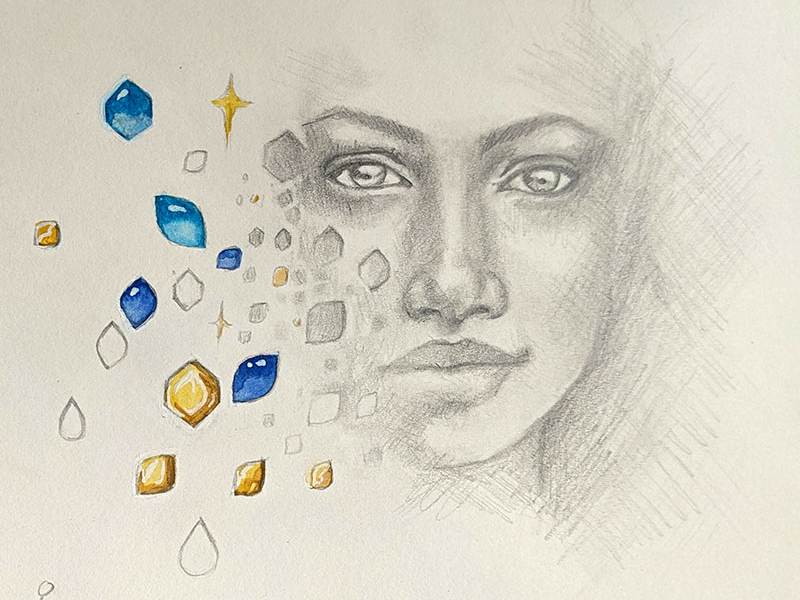
sketchbook drawing of a face with blue and yellow abstract shapes
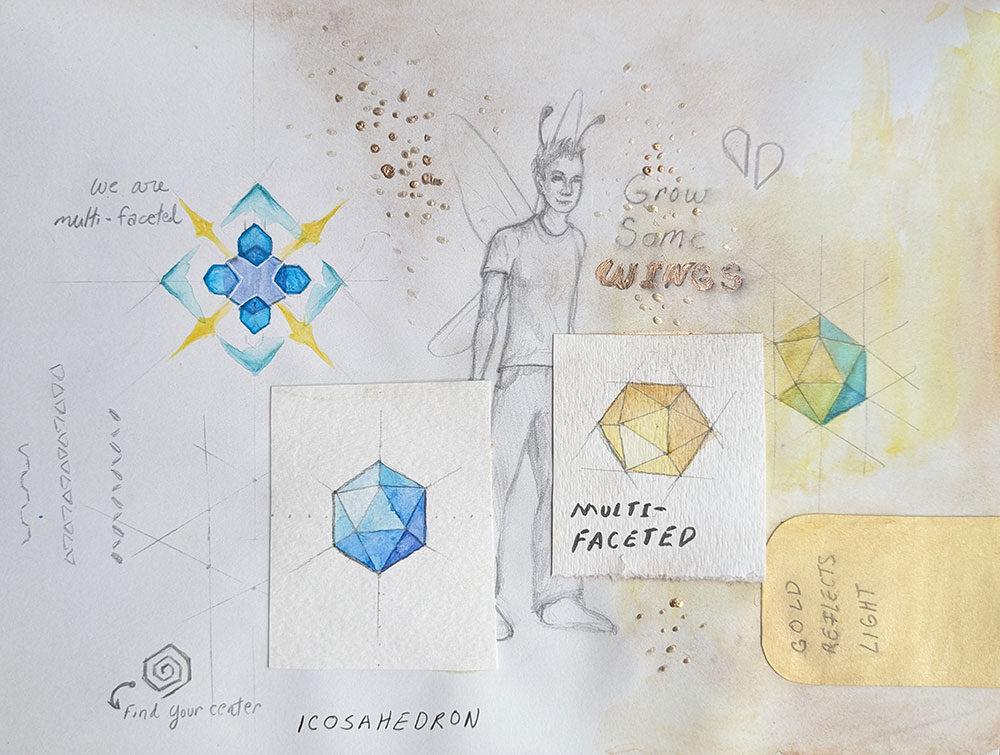
sketchbook collage with a drawing of a young man with antennae and wings, icosahedron shapes in blue and ywllow, abstract angular shapes resembling a kaliedescope

Bringing the Ideas from Paper to Screen

While drawing, I had come up with a collection of words and phrases that I felt were in line with the university's new zeitgeist.

Optimism, freedom of expression, well-being, diversity, collaboration, innovation...

Keeping these concepts in mind, I translated my sketchbook concepts into digital. Mosaics emerged, with the implication of a metallic gold glitter. I created shapes and patterns based on our colors and our existing hive pattern.

I also explored creative photography treatments based on the idea of gold. I used our existing photography as well as some stock selections to explore gold as an identity symbol representing high aspirations and optimism.

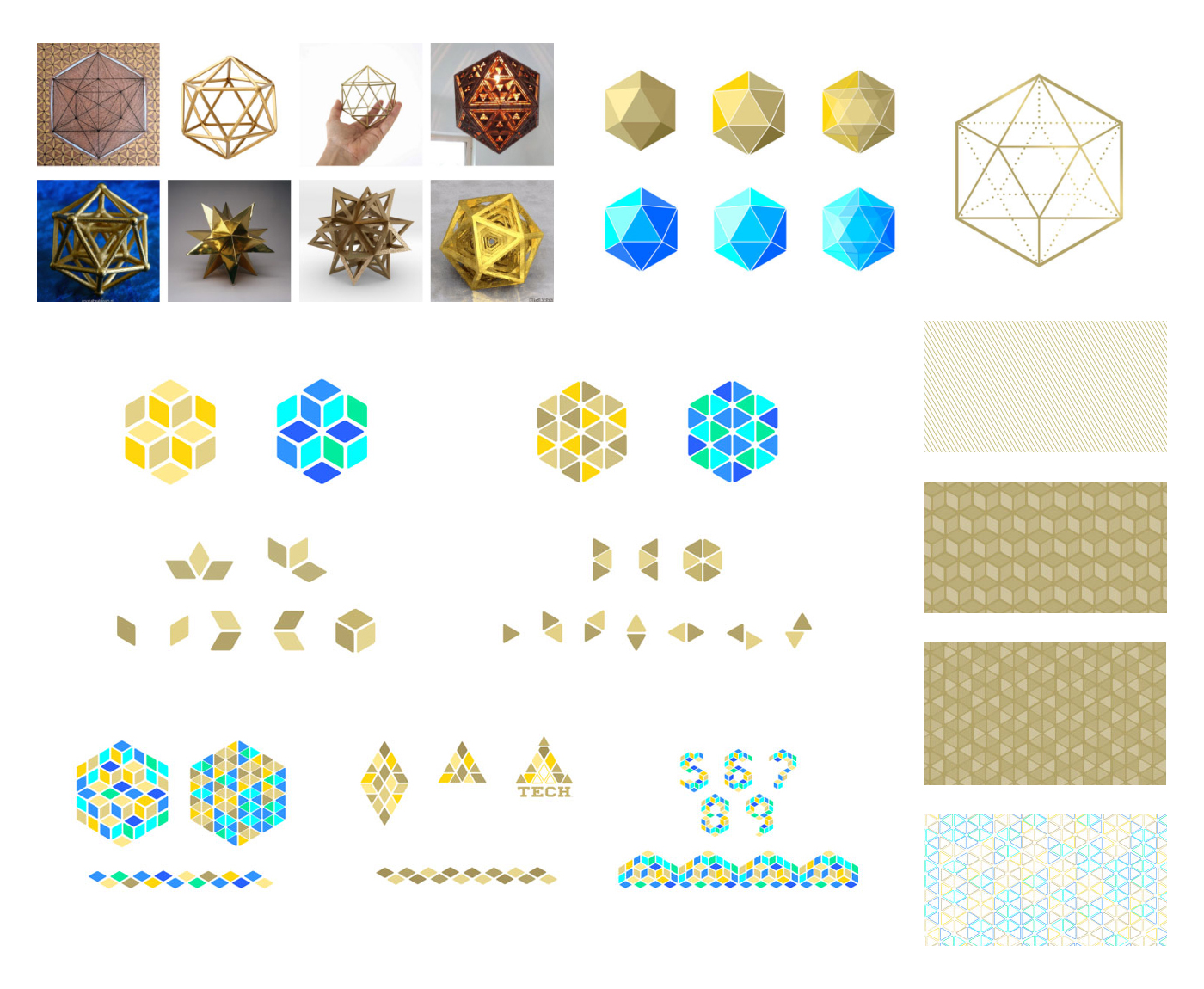
abstract mosaic shapes based on hexagons and triangles
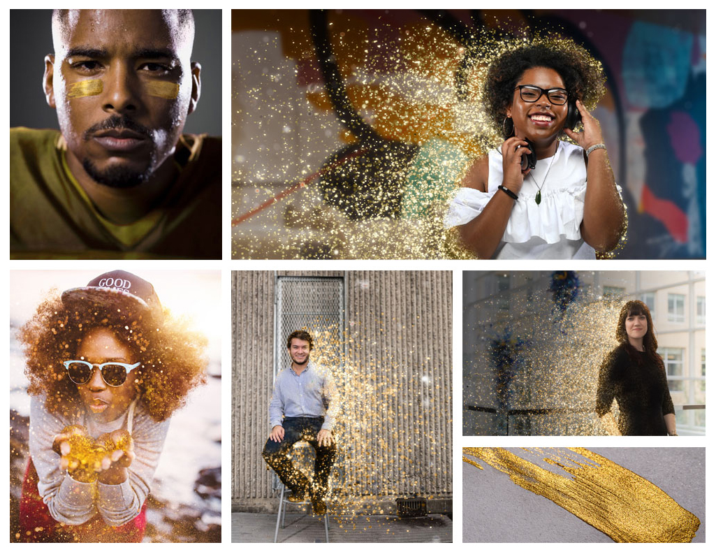
images of college students dispersing into gold glitter, blowing glitter, and with gold metallic face paint

My Brand Concept: A Multifaceted Mosaic

Finally, it was time to put together my concept. I named it "multifaceted mosaic" after the mosaic shapes I'd explored to express our diverse, multifaceted personality. I provided logos, photography direction, colors, and moodboards to express my concept.

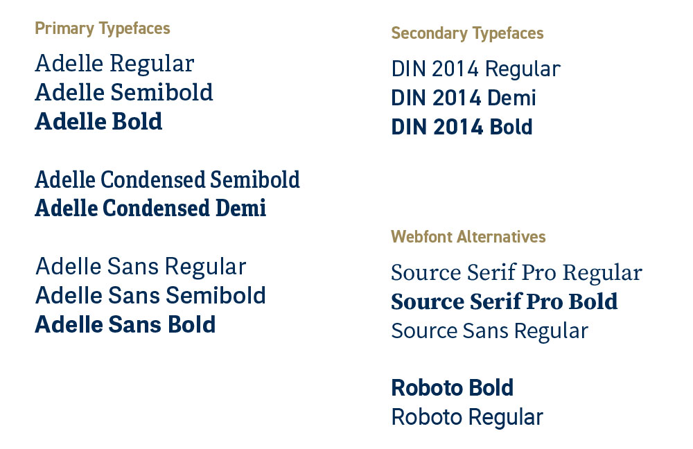
I researched possible typefaces we might use, focusing on legibility and with an eye for variable typefaces, which would offer the best support for digital applications.

I provided photography guidance with an emphasis on color, dynamic composition, and movement. Photography featuring people includes diversity of race, disability, culture, family, and personal expression.

My moodboards included demonstrations of how the brand might be expressed where photography, typography, color, and shapes interact.

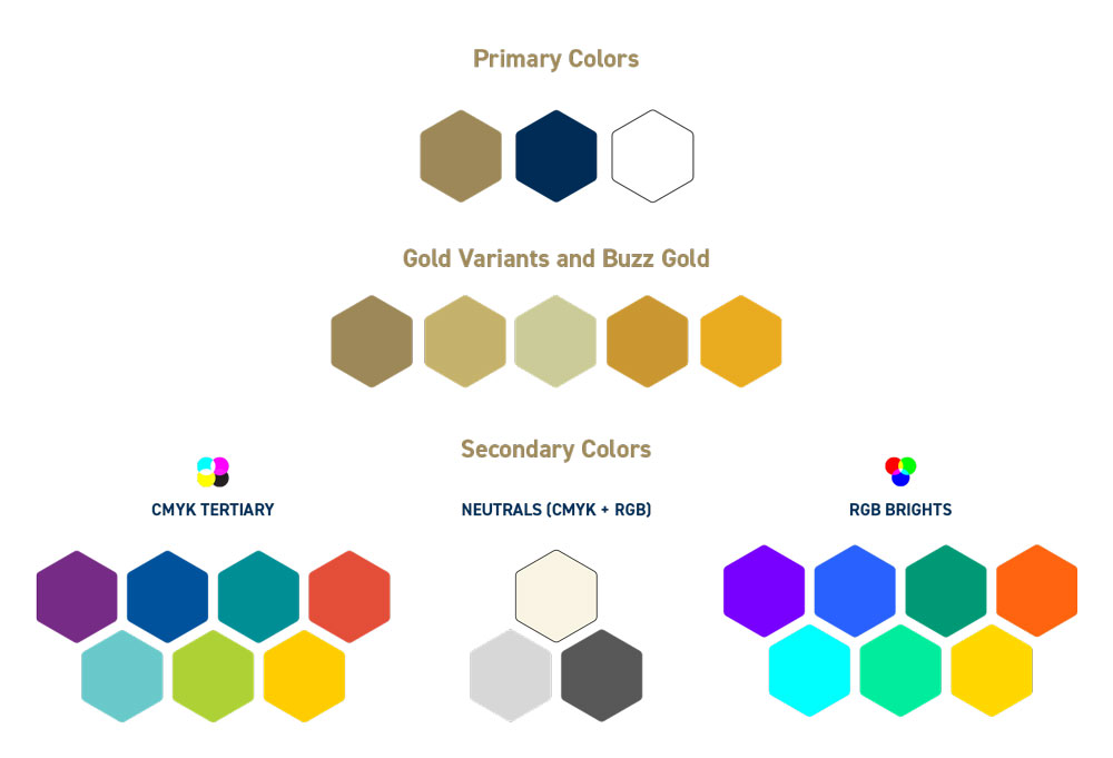
a new color palette
Georgia Tech logo concepts
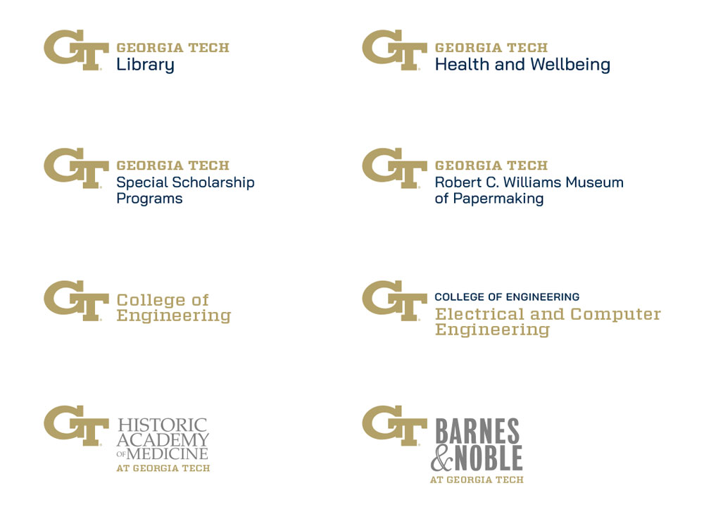
Georgia Tech logo concepts for department variations
photography samples of people - students on campus
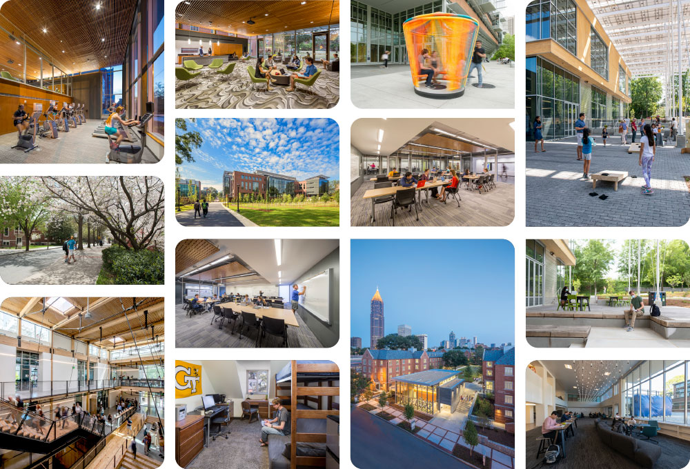
photography samples of campus scenes and architecture
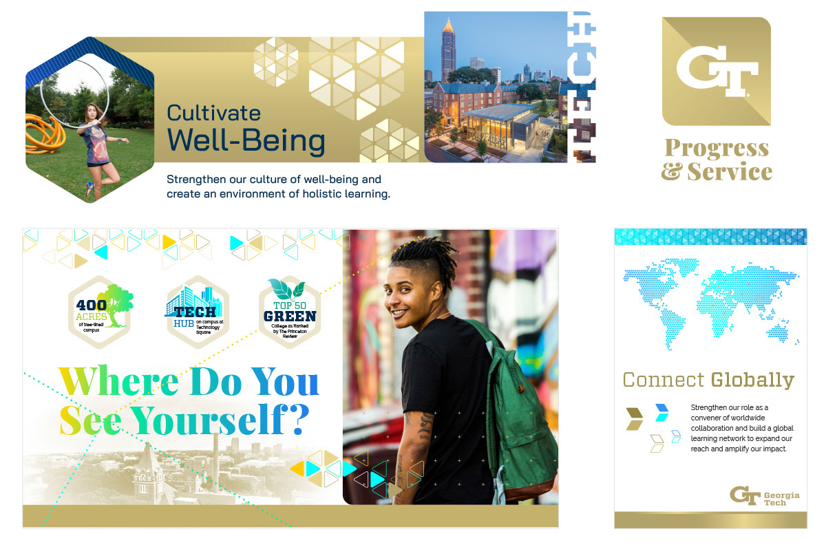
design samples with gold, blue, and smiling students
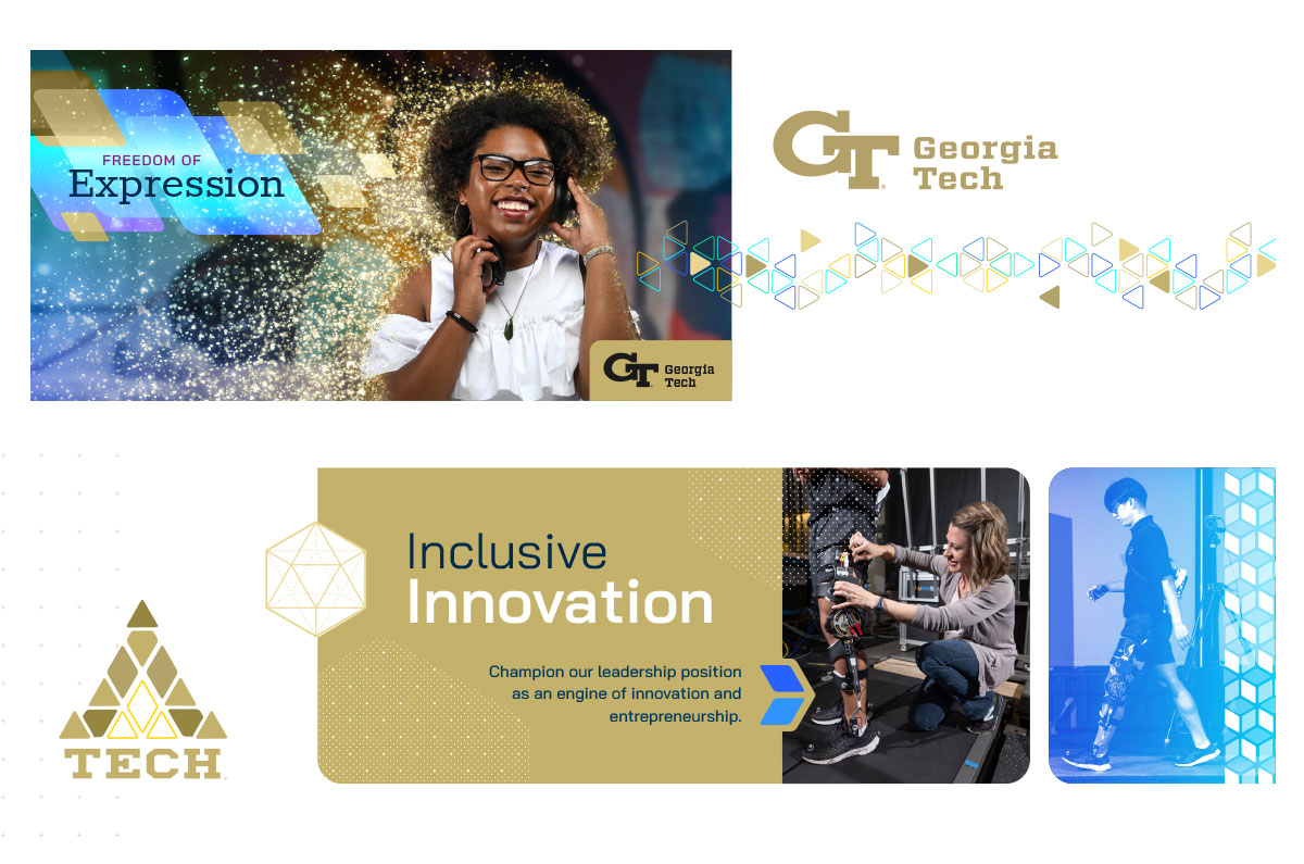
design samples with a glittering young woman, logos, and an accessibility technology for walking

The New Brand

The committee ultimately decided on my colleague's excellent logo treatment. The overall look was to be a combination of our two concepts, with his more minimal and technical concept toning down some of the confetti and sparkle from my concept. We collaborated to combine our ideas and the result was a well-balanced, multifaceted new brand.

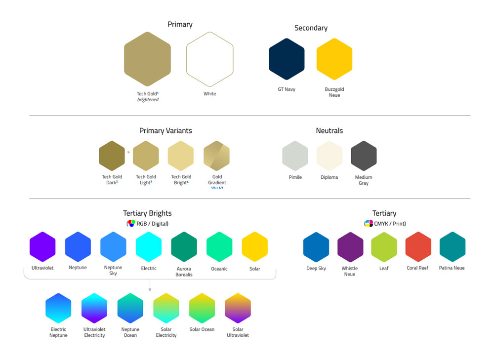
color specimens
typeface specimins
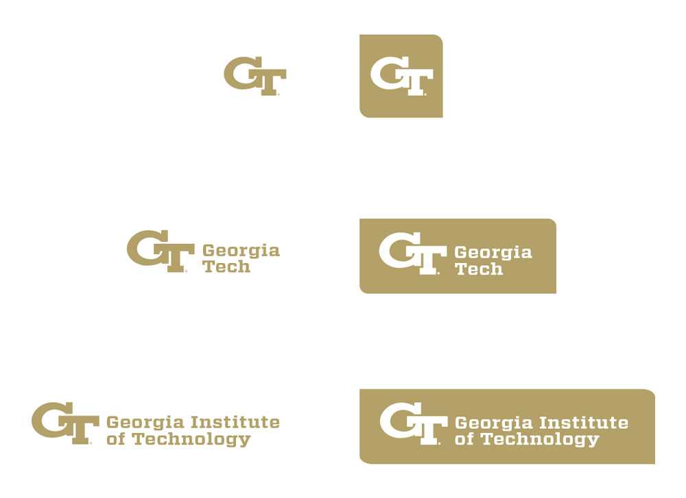
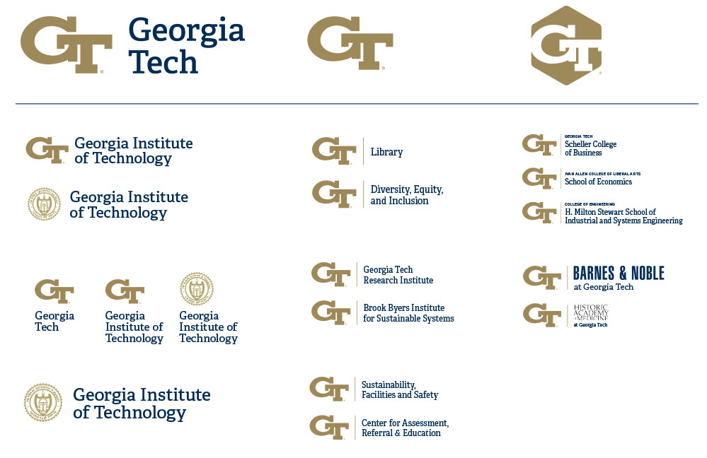
Georgia Tech logos
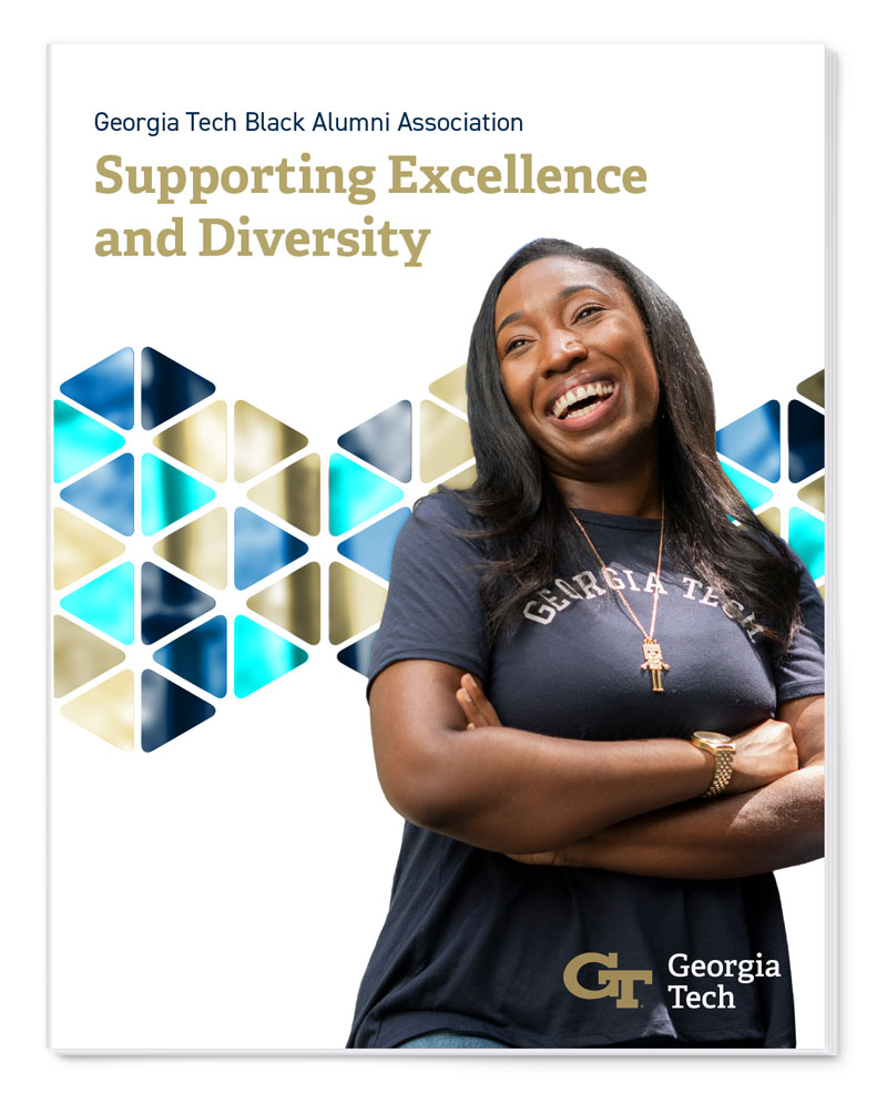
a case statement cover with a smiling black student
campus signage with an updated logo
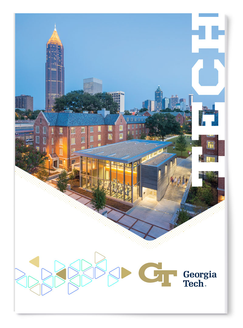
a promotional mailer cover with a photo of a college campus
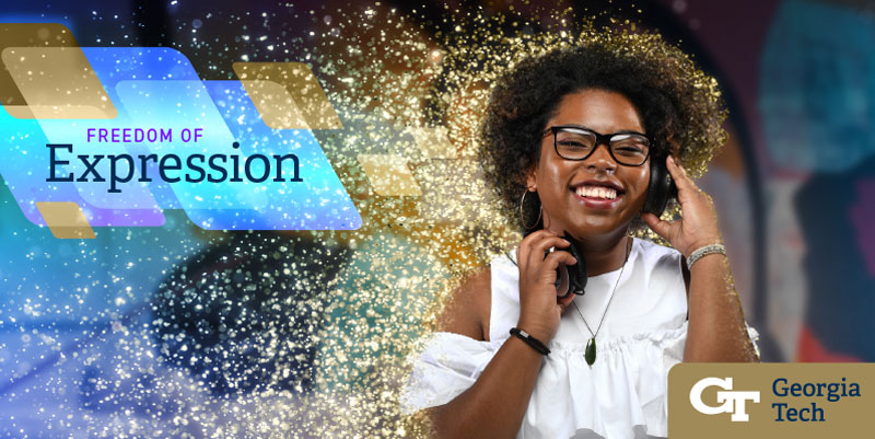
a woman listening to headphones and becoming glitter with filler demo copy text
colorful abstract hexagon and triangle shapes

The goal of a new brand is to give a fruitful foundation that the brand can continue to grow upon. I'm grateful that I had the opportunity to contribute to the new look for this university and I look forward to seeing how the brand evolves over time.