People said to have color blindness do perceive color, but they see differently from those with ordinary vision. Genetic color blindness effects approximately 1 in 12 men and 1 in 200 women. Differences of vision and color perception, however, effect everyone.
The two most common types of color blindness are protanopia and deuteranopia, also known collectively as red/green color blindness. A less common type is tritanopia. Each of these variations effects one of the three types of cones, which are the photoreceptor cells of the eye. Someone with any of these types of color perception is said to have dichromacy, meaning they see with two colors.
Types of Dichromacy
- Protanomaly: perception of red is reduced
- Protanopia: perception of red is absent
- Deuteranomaly: perception of green is reduced
- Deuteranopia: perception of green is absent
- Tritanomaly: perception of blue is reduced
- Tritanopia: perception of blue is absent
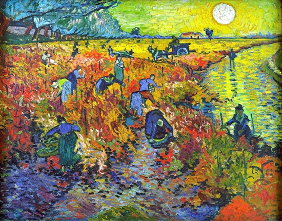
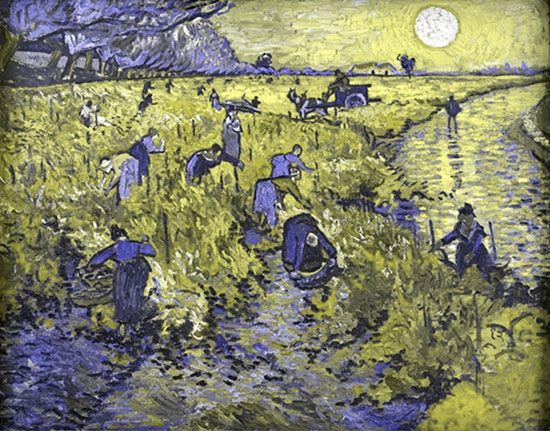
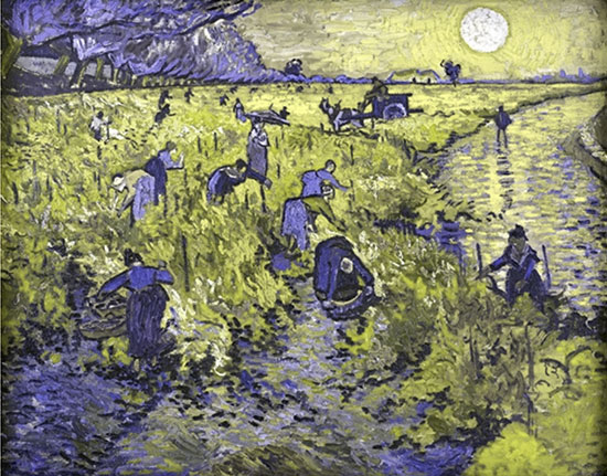
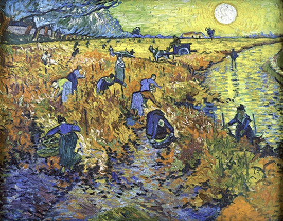
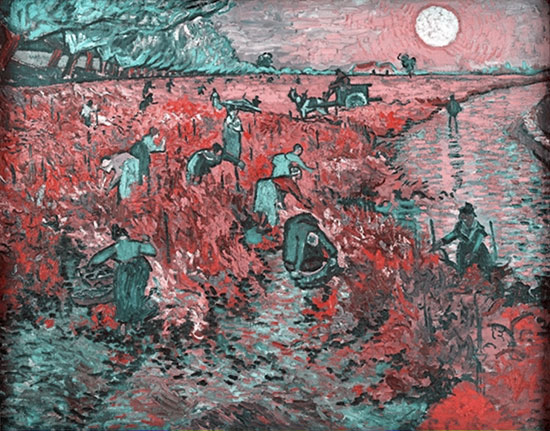
Here are some visuals of Van Gogh's painting, "The Red Vineyard," with filters applied which approximate how it may look to people with these different types of color vision.

Accessible Graphs and Charts
When creating content which communicates through color, such as a graph or map, some information may be unclear for people with different types of color vision. Look at the following map of the United States which demonstrates regions by color. This color coding system could be ambiguous for people with diverse color perceptions.
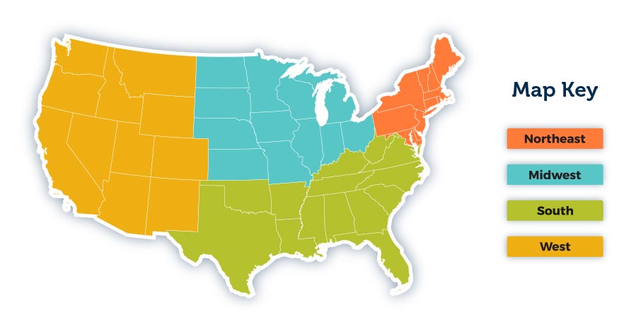
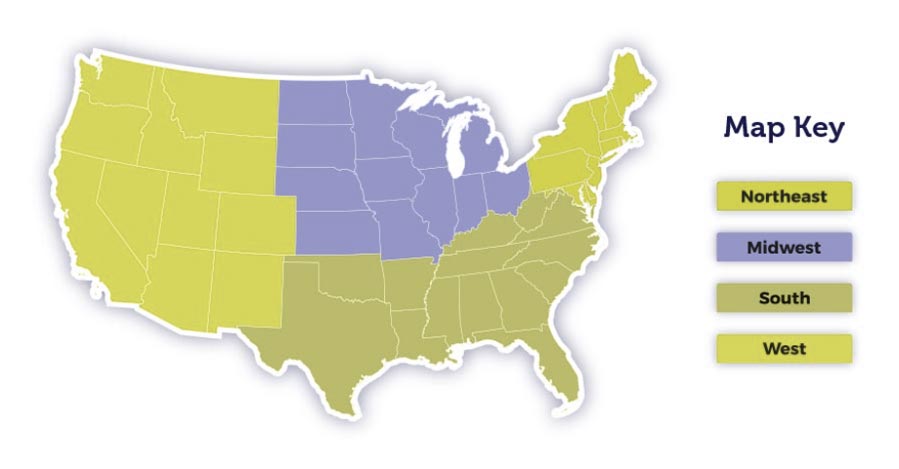
It is advisable to use an additional style besides color to differentiate information. In a line graph, consider using lines that are solid, dashed, and dotted. In a map or a bar graph, use patterns.
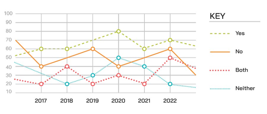
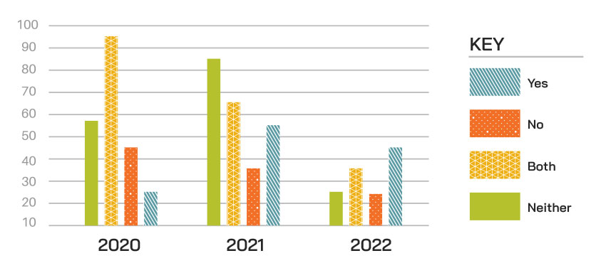
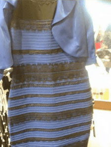
Image: Wikimedia Commons.
The Dress That Caught Our Eye
In 2015 a photo of a dress became a viral internet meme and inspired new scientific studies of vision. Even among those with normal color vision, some people saw a gold and white dress, some saw a blue and black dress, and a smaller number of people saw blue and brown. This phenomenon helped to demonstrate that everyone sees and perceives color differently.
The story of the dress reminds us that when we make things more accessible for color-blind people, we make them more accessible for everyone.
See Your Content How Others See
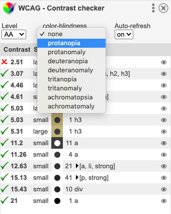
There are several browser extensions and tools which can help you to analyze your web content with empathy for different color perceptions. The WCAG - Contrast checker extension is available for Firefox and Chrome.
WCAG - Contrast checker for Chrome
WCAG - Contrast checker for Firefox
After installing the WCAG extension, you may select from a menu of different types of color perception to see your webpage content more like someone with protanopia, deuteranopia, or another color perception variation.
Everyone perceives color in a unique way. Ensuring that people with a wide range of color perceptions are able to comprehend your website's content is crucial to maintaining an inclusive web presence.