CSS Variables
How to Build a Semantic Color System for your Design System Using CSS Variables
A resource for front-end designers and developers.
Few things have supercharged CSS the way CSS Variables have since they were introduced in 2012. Since then, developers have been working to find better ways to build and organize variable collections.
As an oil painter, I am obsessed with color theory and color perception. This has lead me to develop a deep curiosity about building color systems for the web.
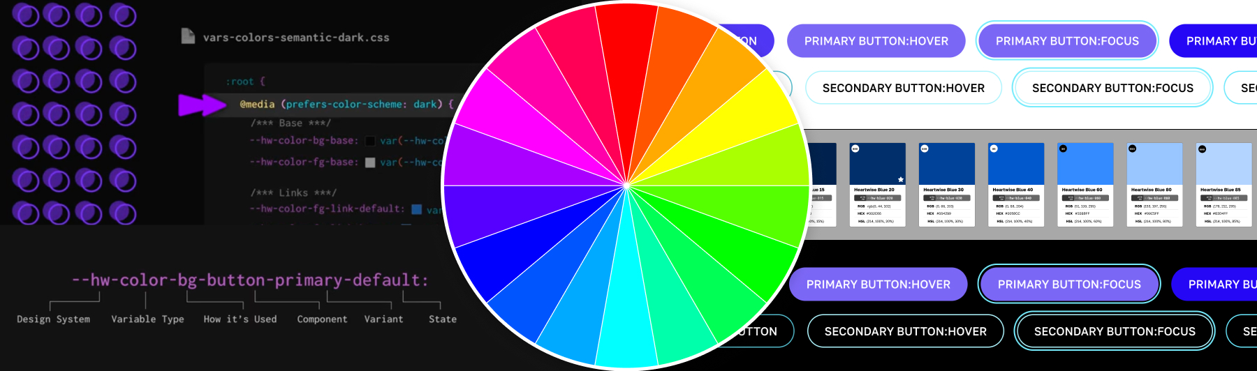
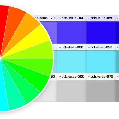
How to we create enough colors for all our component variants? How do we keep track of what colors are for background, foreground, or borders? How to we ensure our color contrast is accessible for each background and foreground combination? Once we've figured that out, how can we make it work in dark mode, as well?
What follows is a collection of writings, video, and code samples that I hope will serve as a resource to other front-end technologists who are interested in color.
Project Details
Tools
- CSS
- CSS Variables
- After Effects
Target Audience
- Front-end designers
- Web developers
- Design system enthusiasts
Medium Article: How to Build a Color Variable Palette
If reading is your jam, I recommend this article I published on Medium about building a color system for your design system using CSS variables. Learn about:
- Why I love HSL color notation
- Why multiple shades of each color are needed
- What are primitive and semantic layers?
- CSS variables for supporting dark mode
Instructional Video
I created this animated instructional video to introduce CSS variables as a design system solution.
- How to build out neutral and primary palettes using HSL
- How to implement primitive and semantic layers
- Intro to supporting dark mode
Codepen Demo
This codepen goes along with the instructional video. Fork it to learn while you watch.
See the Pen Color Testing for CSS Variables Video by Monet Fort (@mfort) on CodePen.
More Codepen Examples
Toggle Between Light Mode and Dark Mode with Select List
This codepen demonstrates light mode and dark mode with a dropdown menu so that you can select them regardless of what your local machine preferences are.
See the Pen Dark Mode Basics by Monet Fort (@mfort) on CodePen.
Color Sliders
This codepen includes sliders so you can adjust the colors and see what the results might be.
See the Pen Color System with Hue Options by Monet Fort (@mfort) on CodePen.
A Patriotic Palette
I created this palette while working as a volunteer for a local nonprofit organization.
See the Pen Bespangled Colors by Monet Fort (@mfort) on CodePen.
Alert Colors
Most design systems will have neutrals, brand colors, and system colors. We use our system colors for things like alerts, which might have variants for each level of urgency they represent (neutral, positive, negative, warning).
This codepen demonstrates how to implement border, background, and text colors for your semantic alert components.
See the Pen Alert Colors by Monet Fort (@mfort) on CodePen.
Dealing with Backgrounds
Web designers often have to deal with a collection of background colors that express the brand. Making sure that your text is accessible on each background is a challenge. This codepen is a staring point for testing multiple brand backgrounds.
See the Pen Dark Mode with CSS Variables by Monet Fort (@mfort) on CodePen.
Accent Color
Accent color refers to the fill of selected form inputs (radio, checkbox, toggle, etc.). Just as it is a good idea to have a standard focus indicator color for your design system, you should also consider using CSS variables to build an accent color for your form fields.
See the Pen Inputs and Accent Color by Monet Fort (@mfort) on CodePen.


